Our team approached the product with the goal of revitalizing the packaging to stand out to the younger population & to rid Land O Lakes of the stigma it once had using the indigenous women Mia as their logo. Once the packaging was redesigned, our next goal was to identify key insights/problems with the current LoL offerings, through identifying these pain points, we were able to offer a much more compact product that offered no mess while cleaning, easy to share, easily disposable, while maintaining a premium over the older tub designs.
Land O Lakes Product Design
Package Redesign & Prototyping
Date: December, 2021
ABS 3D Print with Printed Packaging, Foil Packaging for Sticks, Bamboo
Group Work with Noah Deutsche, Jason Leo, Echo Zhao, Takeo Takonuri, Wenyu Xue
Harvard Graduate School of Design: VIS 2415


Key Takeaways

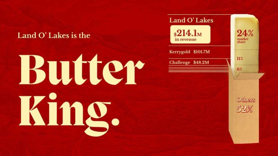
Shelf Real Estate

Logo Evolution


Problematic Figure Mia

Our Target Audience

Key Insights


-

Land O Lakes Butter Bites
Introducing the Land O Lakes Butter Bites. Why scrape butter out of a messy old tub when you can have pre-portioned bites of artisanal butter on a ready-to-go spreader?Packaging designed to be playful while keeping it classy.
-

Exploded Content Axon
We wanted to engage with our younger audiences while maintaining our existing customer base. Our packaging is vibrant, proper, and intricate whilst modernizing some of the elements that defined Land O Lakes, such as the mountain and lakes found on the older packagings.

Our Foil Packaging Reflects our Brand

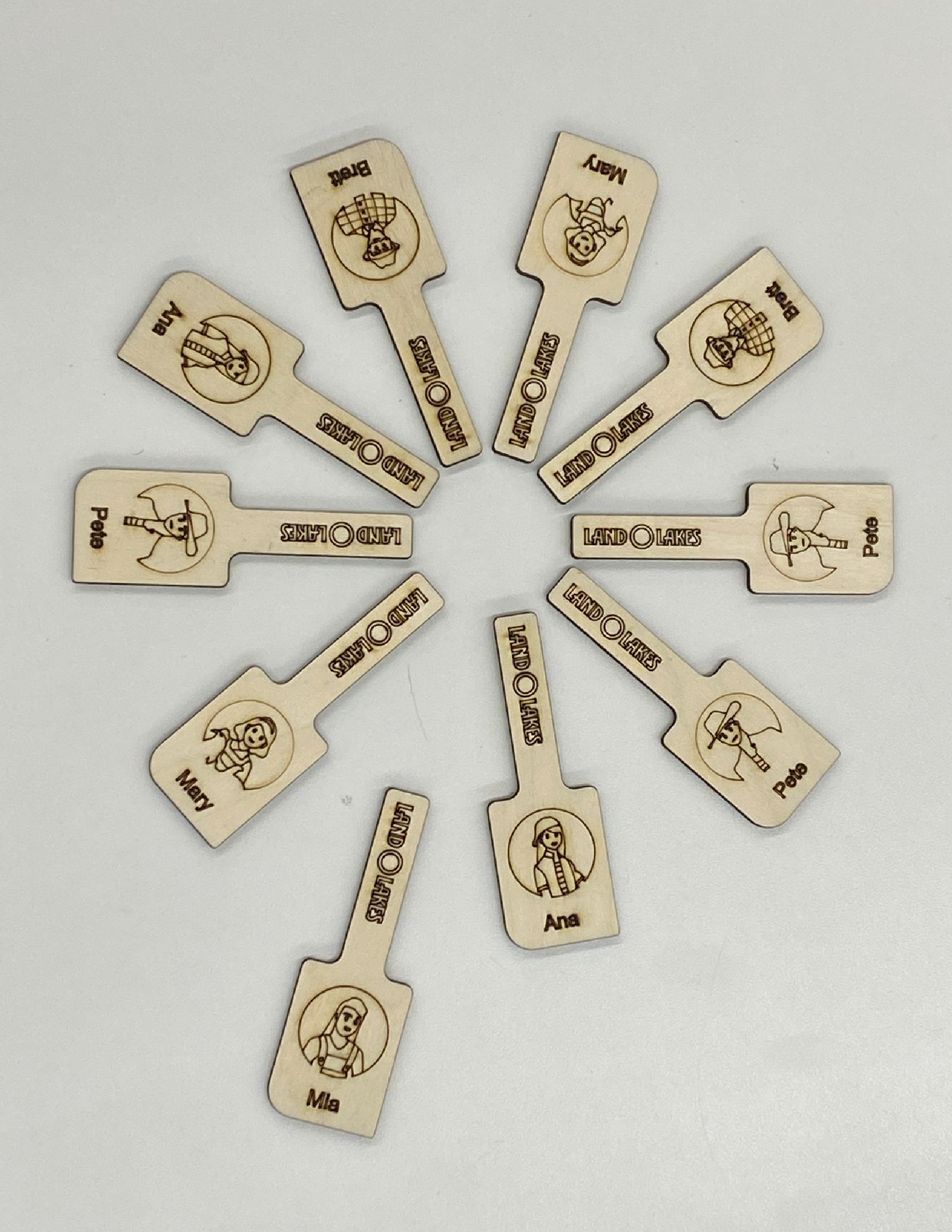
Butter Spreader Designed for Any Occasion

With Farmer Easter Eggs on Every One


E-Commerce Shelf


